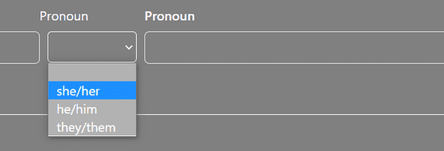
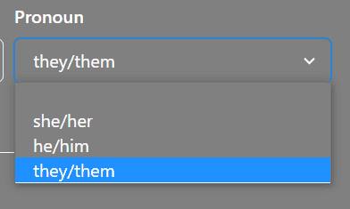
I resolved an interesting issue while continuing the build on my registration form for the Breeze Lakes Point project using Next.js. I really struggled to find the proper way to style the Formik Chakra UI SelectControl component so that it matched the other controls. I wanted to have drop-down lists styled with the same grey background and white text that was the default for the form.
The default theme style for the SelectControl was to display the drop-down items with a white background that blended with my text color, which is set to white.

<SelectControl
name="pronoun"
id="pronoun"
label="Pronoun"
marginLeft="10px"
>
<option value="0"> </option>
<option value="1">she/her</option>
<option value="2">he/him</option>
<option value="3">they/them</option>
</SelectControl>I Googled for a solution but wasn’t finding anything that helped me determine how to reset the background color of the drop-down items on the SelectControl.
I was able to style a conventional select control with classes defined in my global.css so that the display matched the other form controls.

<select className="bgtransparent form-element">
<option className="bgtransparent-child" value="0"> </option>
<option className="bgtransparent-child" value="1">she/her</option>
<option className="bgtransparent-child" value="2">he/him</option>
<option className="bgtransparent-child" value="3">they/them</option>
</select>The issue with this solution was that I wasn’t able to leverage the Formik and Yup conventions to populate the control with values, validate input values, or gather the selected values for use in form submission. I could certainly have written some additional functions to handle those actions but I wanted to be able to manage all form inputs in the same way. Using the SelectControl included with formik-chakra-ui was the way to accomplish those goals, but the configuration that worked for a conventional select control did not work for a formik-chakra-ui SelectControl.
I spent some time simply hovering over pieces of my code in VS Code to see what the intellisense might suggest for formatting the SelectControl. I tried a few options but was drawn back to the option to use HTML Attributes.

I recalled in my searches and other code examples that the use of the double {{}} allowed execution for code like additional formatting. I added style={{ backgroundColor: "gray" }} to each option for the SelectControl to blend into the current page color.
<SelectControl
name="pronoun"
id="pronoun"
label="Pronoun"
marginLeft="10px"
>
<option style={{ backgroundColor: "gray" }} value="0">
</option>
<option style={{ backgroundColor: "gray" }} value="1">
she/her
</option>
<option style={{ backgroundColor: "gray" }} value="2">
he/him
</option>
<option style={{ backgroundColor: "gray" }} value="3">
they/them
</option>
</SelectControl>This code allowed me to style the SelectControl to match my page style and capture the values for submission to the database.


The next refactor of this code is to write a more flexible option for incorporating styles into the individual options.
I wasn’t able to find any other sources that explained how to accomplish the solution. I hope this explanation will be helpful to other developers working with Next.js, Formik, and Chakra UI.